EXHIBITION & EVENT
SIGNS
Christmas Print Essentials
CLOTHING
STATIONERY
PERSONALISED SWEETS
COVID-19 ESSENTIALS
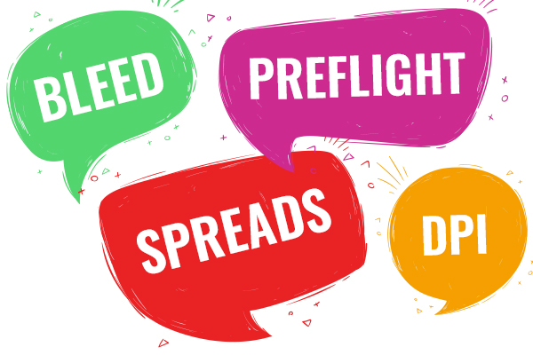
No one wants to deliberately confuse their clients, however, it’s inevitable that you will come across some jargon and industry specific terminology from time to time. When discussing your project with a graphic designer or the printers, you might find they use some words or terms that leave you scratching your head. Most of the time, they will explain in layman’s terms, and we’re sure they will happily explain anything you don’t understand. Nevertheless, we have put together this handy guide, so the next time you work with a designer or send your project to the printers, you can bust your way through the jargon.

1. A / B / C Sizes
The standard paper sizes are A sizes such as A4 and A3. B sizes are less common but are normally used for larger print jobs such as posters. Finally, C size are used for envelopes.
2. Bleed
This is added space around the design that will be trimmed. You may find a printer will ask for a certain bleed such as 2-3mm for colour or images to continue off the edge, this is to ensure the work continues to the very edge of the design.
3. CMYK
CMYK stands for cyan, magenta, yellow and key (black). This is a colour mode that is mostly used for print media to achieve true to life colours. Work can be converted to CMYK once a project has been designed.
4. Composition
The composition is how all of the different elements such as images, text and shapes sit on the page. It is effectively the layout of everything and can have a huge impact on the overall design and how it grabs someone’s attention.
5. DPI and resolution
DPI means dots per inch. The more dots per inch there are, the higher the resolution. The resolution is extremely important to make sure your work is printed to the highest quality without pixelated, blurry images. A simple way to check is by if your design is suitable for print, is by zooming well over 100% to see how the quality will look.
6. Gradient
When colours fade into each other, this is a gradient. It can be extremely subtle or bold and can be an impactful effect on different designs.
7. Gutter
The gutter stands for the inside margins or the empty space needed between pages. A gutter is needed when created books, brochures or magazines that need binding to ensure no content is hidden.
8. High Resolution
You may find designers will ask you for a high-res image or a high-res version of your logo. This means your image needs to be sent at 300dpi (dots per inch). This is to make sure you have the highest quality print without any unpleasant looking pixels. Many images for the web are 72dpi and look fine on your screen, but may blur when printed.
9. Negative Space
Also known as white space, this is just literally white space. When used effectively, white space can help emphasise certain elements and ensure the design isn’t overly cluttered.
10. RGB
RGB is the main colour mode and stands for red, green and blue. There is a huge amount of colour options with RGB compared to CMYK, which is why it is the most commonly used colour mode for screens and online. Many printers will ask for RGB designs to be converted to CMYK as the colours will be truer.
11. Sign Off
This is a simply the term to say you are happy that the work is complete. Once a design is ‘signed off’ it is ready to be sent to the printers.
12. Typography
This refers to the text used on your design. It is everything from the font used, to the style and spacing. Effective typography is an important skill for a designer and the style and spacing can have a huge effect on how receptive people are to the overall design.
More useful design tips you can find in our Artwork Guide.
If there are any terms we haven’t covered, or you would like to find out more about our design and print service, get in touch!
